Practical Responsive Images
Responsive Websites need Responsive Images

<picture> and srcset/sizes

Since the first half of 2014 there has finally been agreement on how the web community and browser developers might take a common approach implementing a solution. This is thanks to the Responsive Images Community Group and a large body of supporters in the broader web community.

Following painstaking work the <picture> element, and srcset and sizes attrbutes are finally supported by the major browser manufacturers, with the Picturefill polyfill, giving solid support for 'legacy' browsers, we should now be seriously considering using these new functions in all of our projects.

...read more about the <picture> element, and practical example of responsive images in use...


A recording is available of Ben's talk on Practical Responsive Images from 'Digital Henley'.
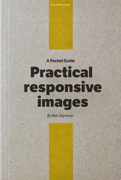
Pocket book now available

The "Practical Responsive Images v1.1" pocket book by Ben Seymour (formerly published by Five Simple Steps.) Version 1.1 revised October 2017.

Available to buy in ePub, mobi & PDF.

Dynamic Imaging Systems

The final gnarly part of this problem relates to how we can practically create, manage, serve and maintain all of the image variants that our designs, and now our browsers, support, for all of today's and tomorrow's devices.


Batch static workflows can take you part of the way, but server-side Dynamic Imaging Systems probably need to become the tools for the masses, rather that just the large eCommerce sites that they have more typically been associated with.

...read more about Dynamic Imaging Sytems, and the opportunities they offer us in today's changing landscapes...


We are curating a list of SaaS Dynamic Media solutions, and would appreciate your input, in keeping it up to date.